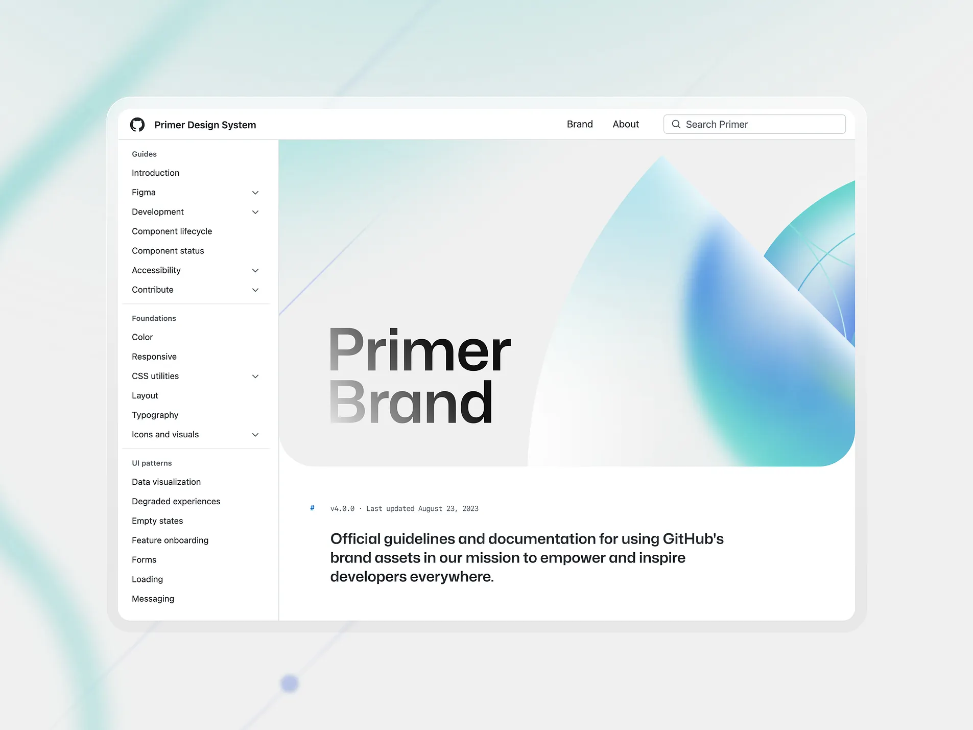
Introduction to Website Design
Welcome to the contributor’s guide for FOSS UoK website! We follow the Primer Design system, which is GitHub’s design system. Primer provides a consistent and accessible user experience across different platforms. If you’re a beginner looking to contribute, this document will help you understand the key principles and guidelines to follow.
We also use Mantine UI for our components and ensure they are aligned with Primer Design principles.

Guidelines for Contributors
1. Follow the Primer Styling
- Instead of using default Primer components, we used Mantine UI components to develop website.
- Ensure that Mantine UI components are styled and customized to align with Primer Design.
- Follow the typography and spacing conventions defined in Primer.
2. Maintain Consistency
- Stick to the defined color palette and UI elements.
- Ensure buttons, inputs, and navigation bars match the existing style.
- When using Mantine UI components, apply Primer-compatible styles and configurations.
3. Accessibility Matters
- Always ensure proper contrast, focus states, and keyboard navigability.
- Use ARIA attributes where necessary to improve usability.
4. Responsive Design
- Ensure the website looks good on different screen sizes.
- Use flexible grid layouts and avoid fixed widths.
5. Code Standards
- Keep code clean and well-documented.
- Follow semantic HTML principles and use BEM naming convention for CSS.
6. Testing & Review
- Before submitting a pull request, test your changes in both light and dark modes.
- Ensure no breaking changes in existing components.
- Verify that Mantine UI components function correctly and maintain the Primer Design look and feel.
By following these guidelines, you can contribute effectively while maintaining the integrity of our website’s design. Happy coding!